AS
View Prototype
RUPAUL'S DRAG RACE WINNERS INFOGRAPHIC
March 2026
UX / UI Design
Figma
Adobe Illustrator
SUMMARY
BACKGROUND
Reality TV fans struggle to keep up-to-date with their favourite shows’ ever-evolving lore, resulting in the need for dedicated fan accounts and pages (e.g. Wiki fandoms) that synthesise and share digestible, data-driven insights.
PROBLEM
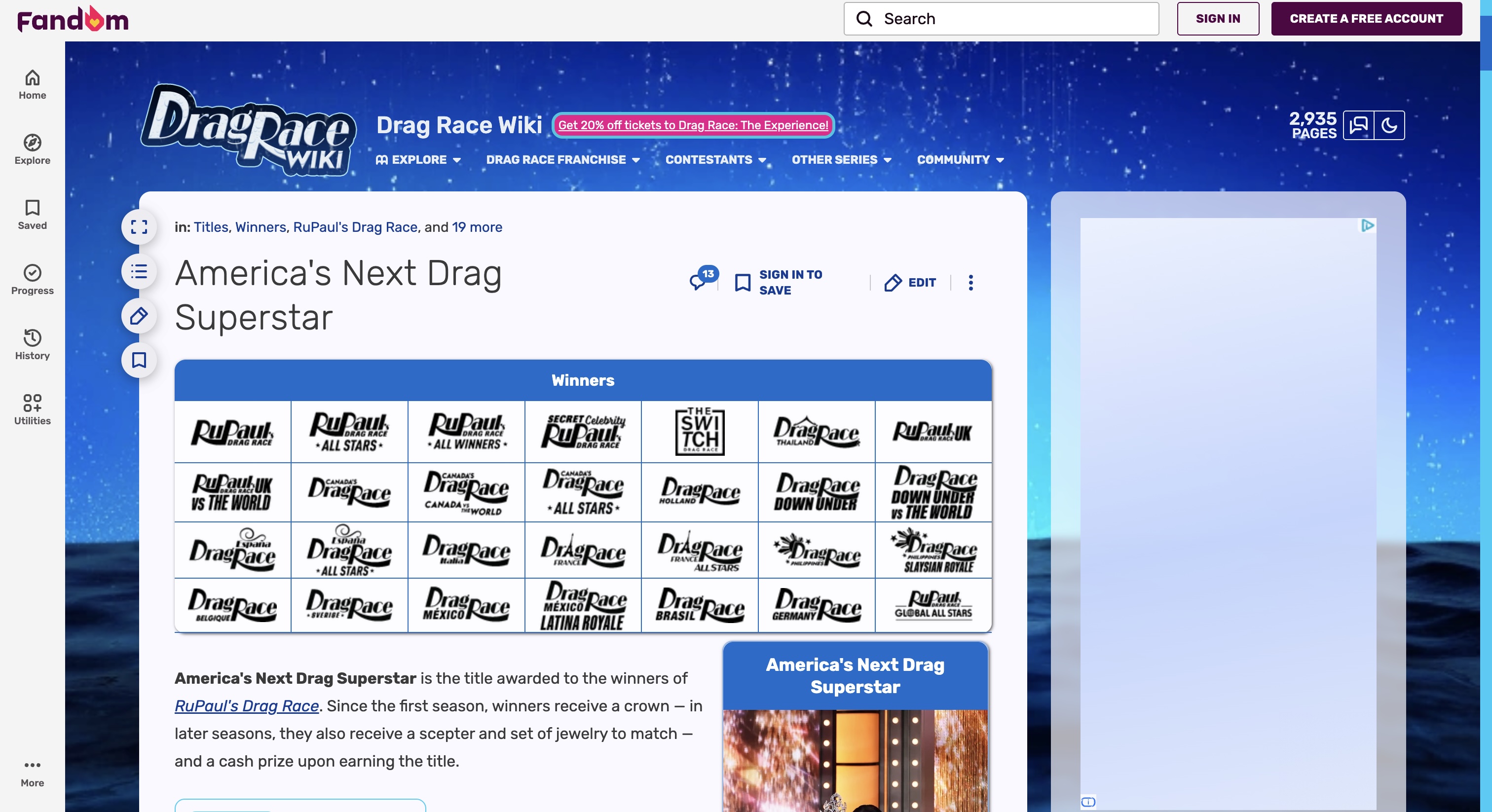
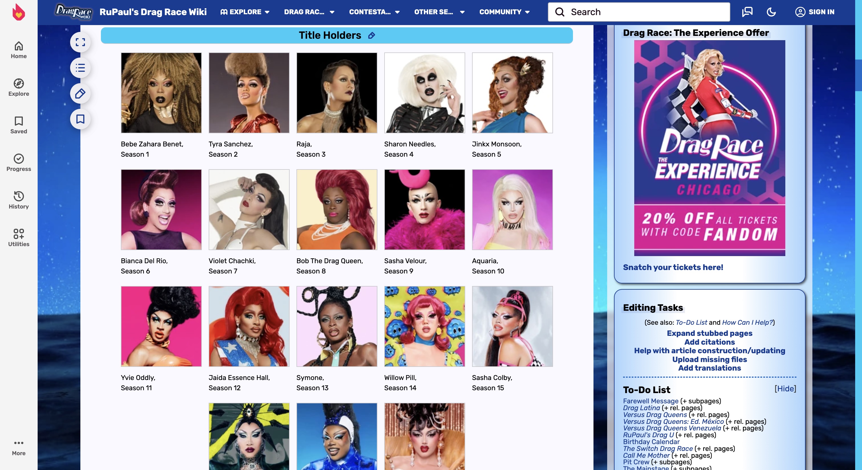
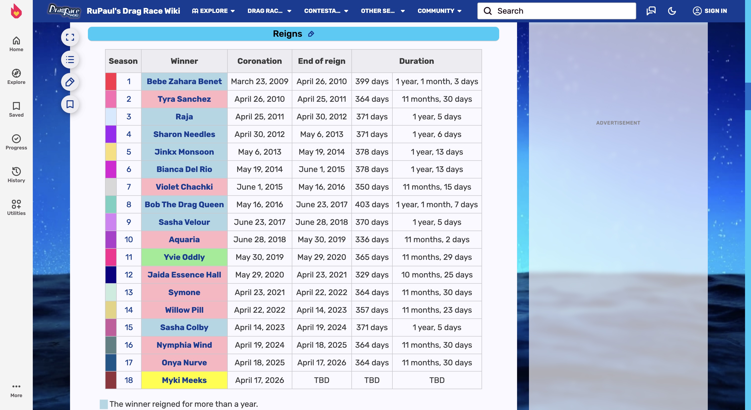
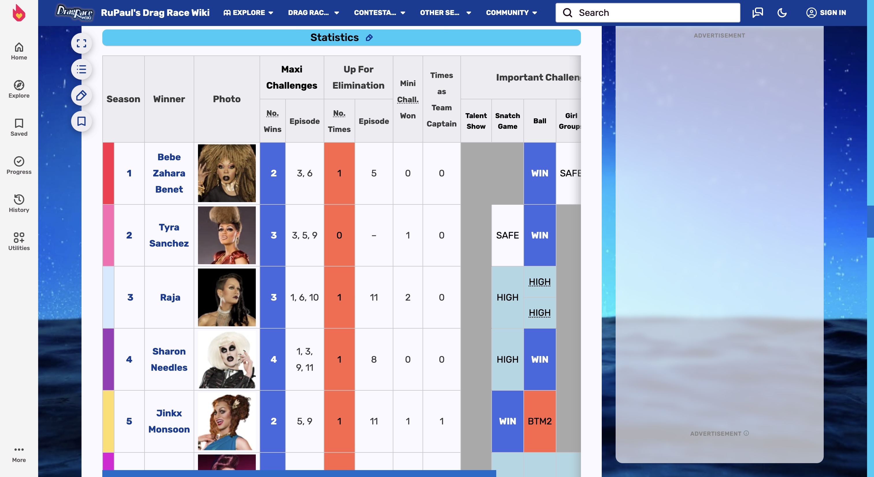
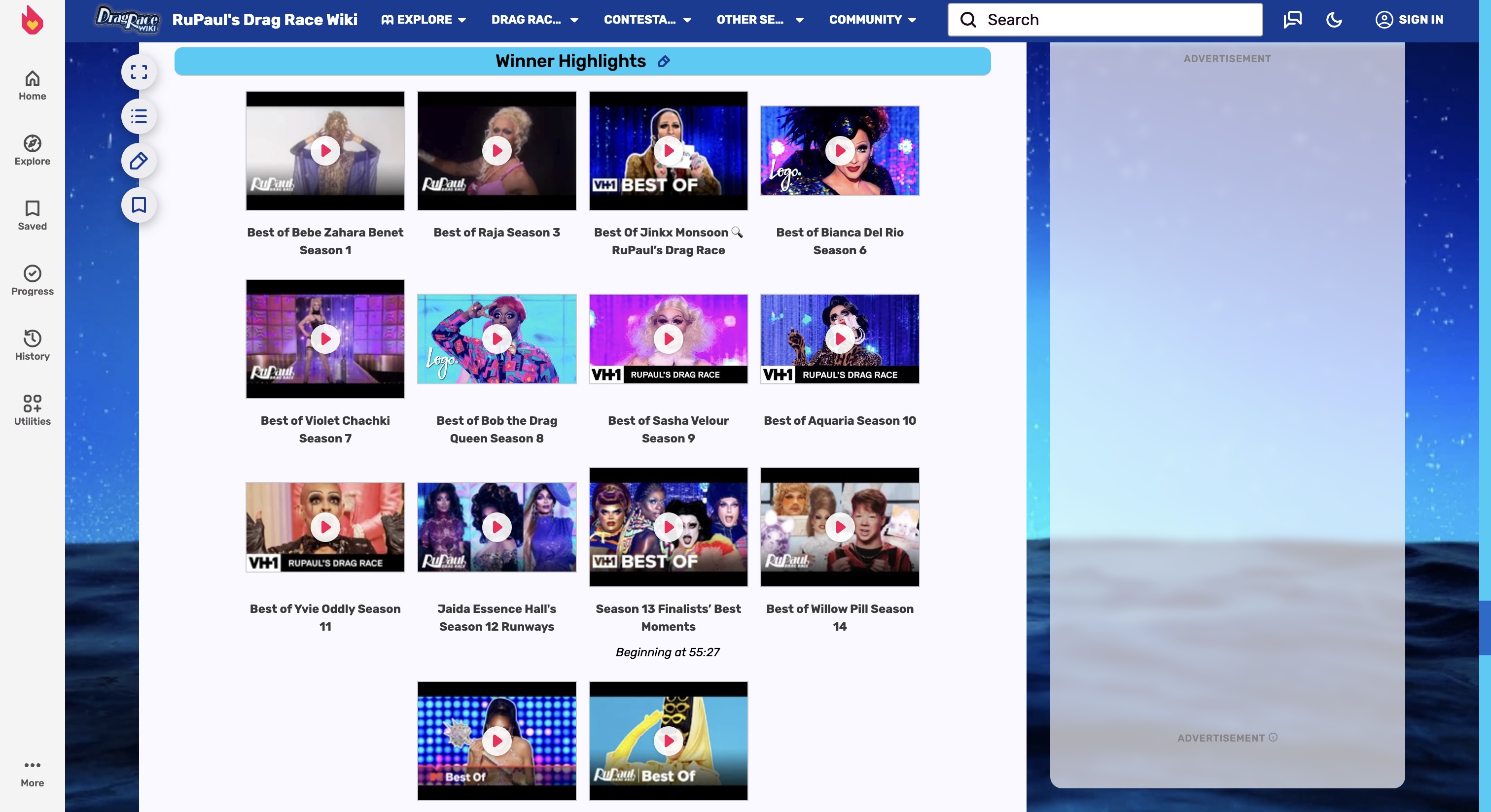
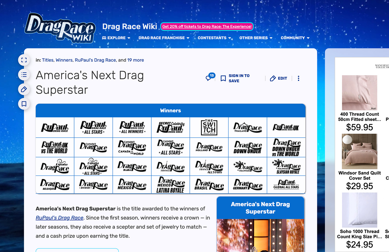
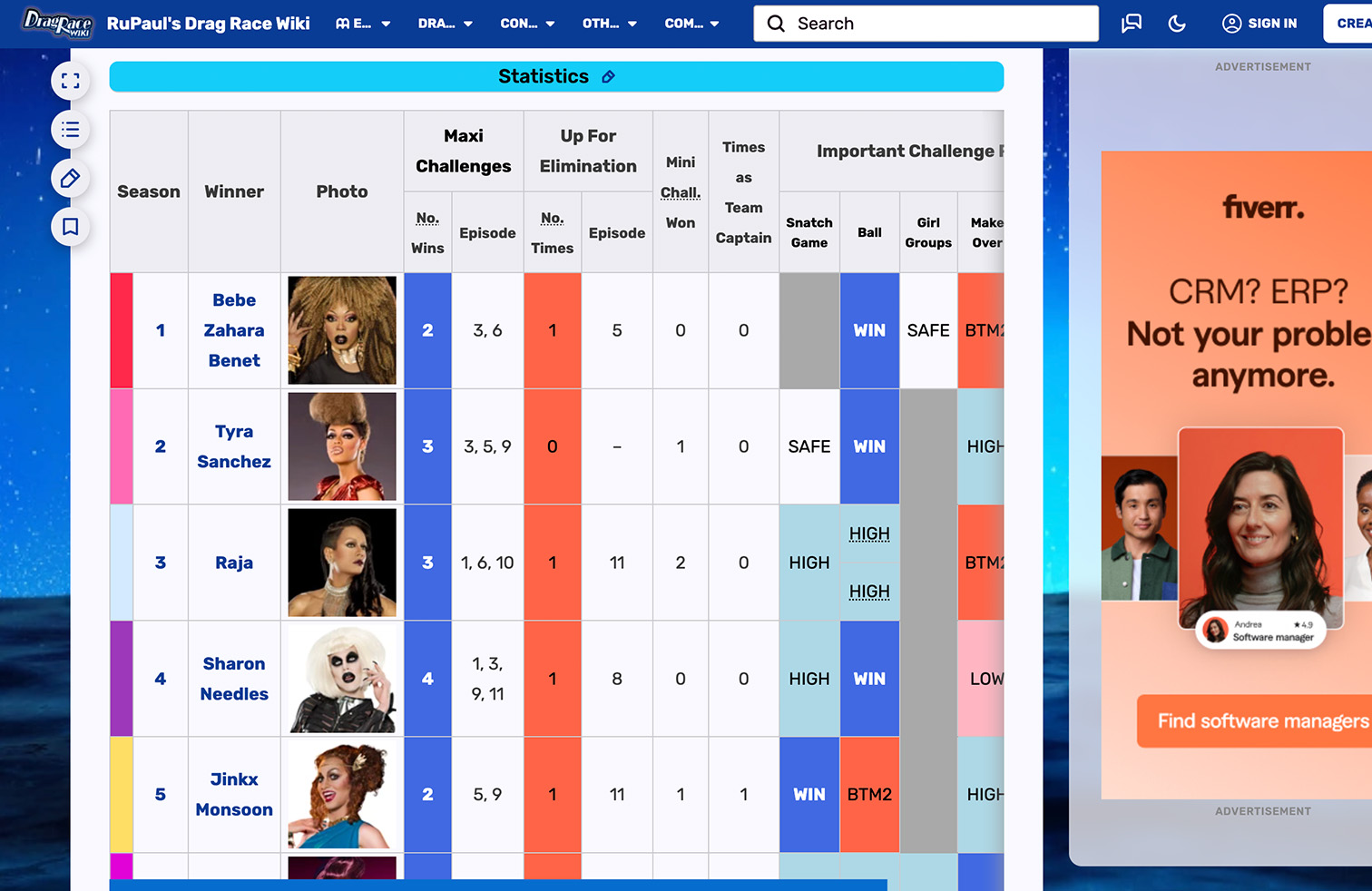
The design of the RuPaul’s Drag Race (RPDR) Wiki is static and dated; with multiple information-dense excel tables that are difficult to interpret and no glamorous and camp aesthetic that the show is renowned for, visiting the site feels clinical and uninspiring.
APPROACH
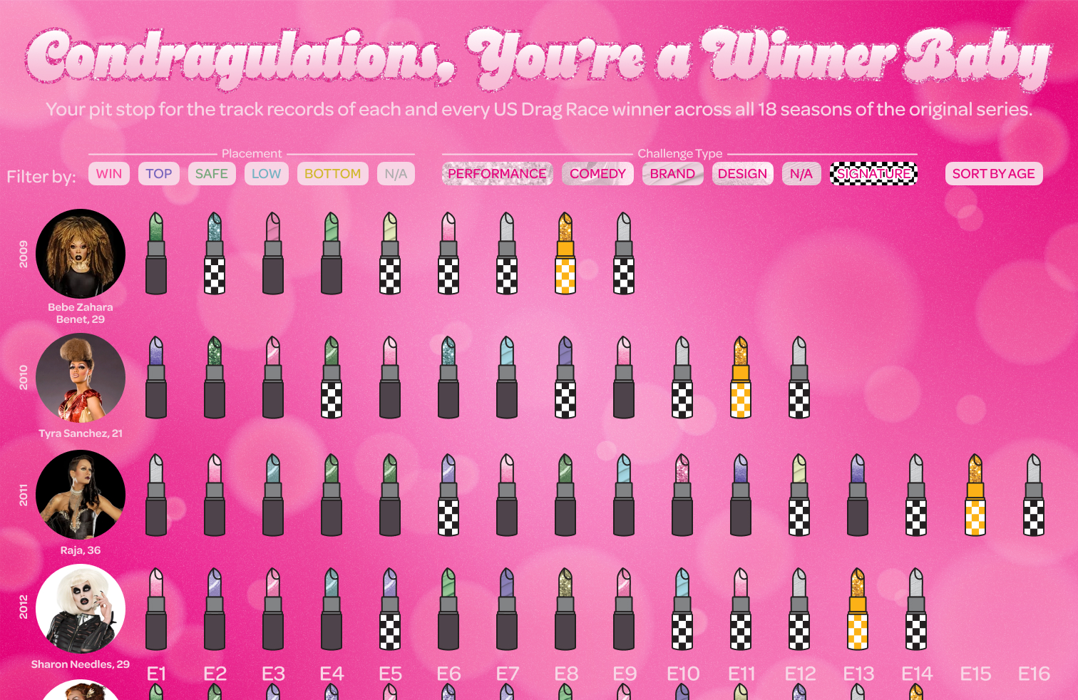
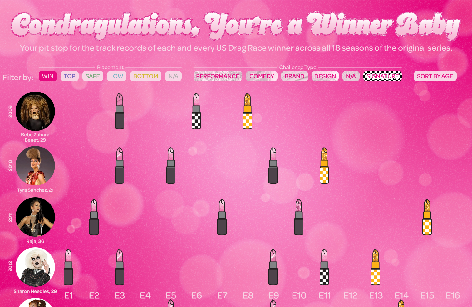
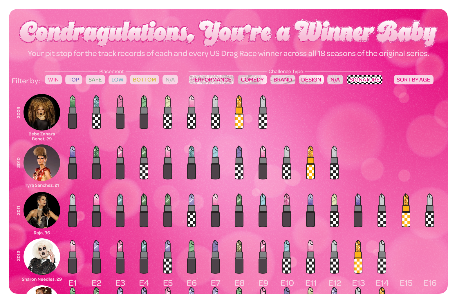
I designed an interactive infographic prototype in Figma that reflects the show's striking visual identity, using assets developed in Adobe Illustrator to blend data analysis with entertainment.
OUTCOME
Unlike the Wiki's static, text-heavy tables that lack any meaningful visual connection to the franchise, this infographic leverages interactivity to educate users on RPDR winners’ legacies, encourage personal interpretation of the data and immerse the user in the vibrant world of RPDR.
PROBLEM
PROBLEM
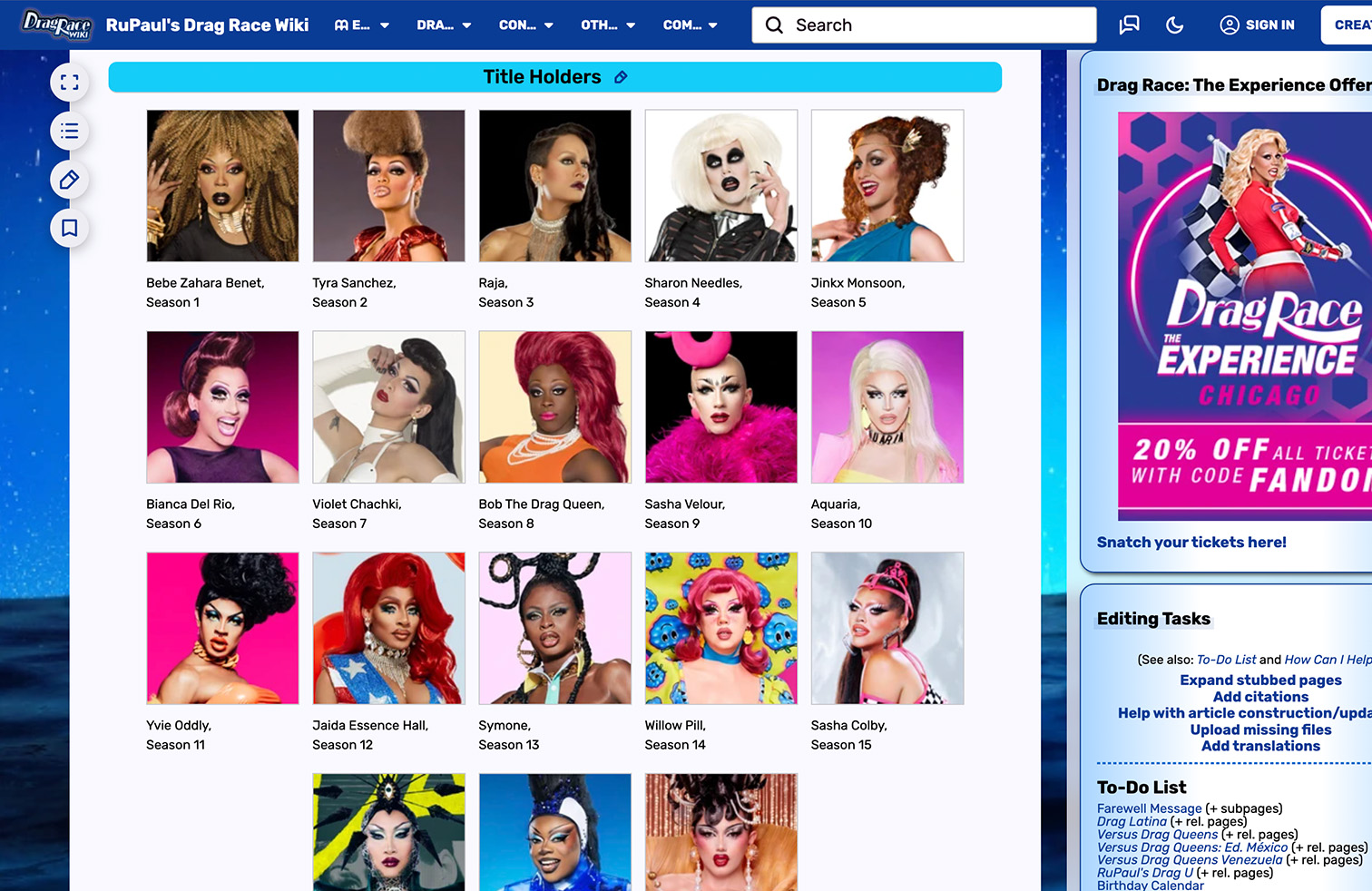
The RuPaul’s Drag Race (RPDR) Winners Wiki page design is static and dated, visiting the site feels clinical and uninspiring.
Entering or belonging to a reality TV fandom can be quite the undertaking due to sheer information overload, since every show has its own deeply entrenched, complex and long-standing lore to learn and stay on top of. Fan accounts and pages that synthesise and share data-driven insights for their favourite shows help users to:
• Absorb critical information easily and quickly
• Uncover hidden trends and patterns in production decisions, character portrayals, and other valuable insights
• Cultivate a community of dedicated fans that extends beyond the show itself
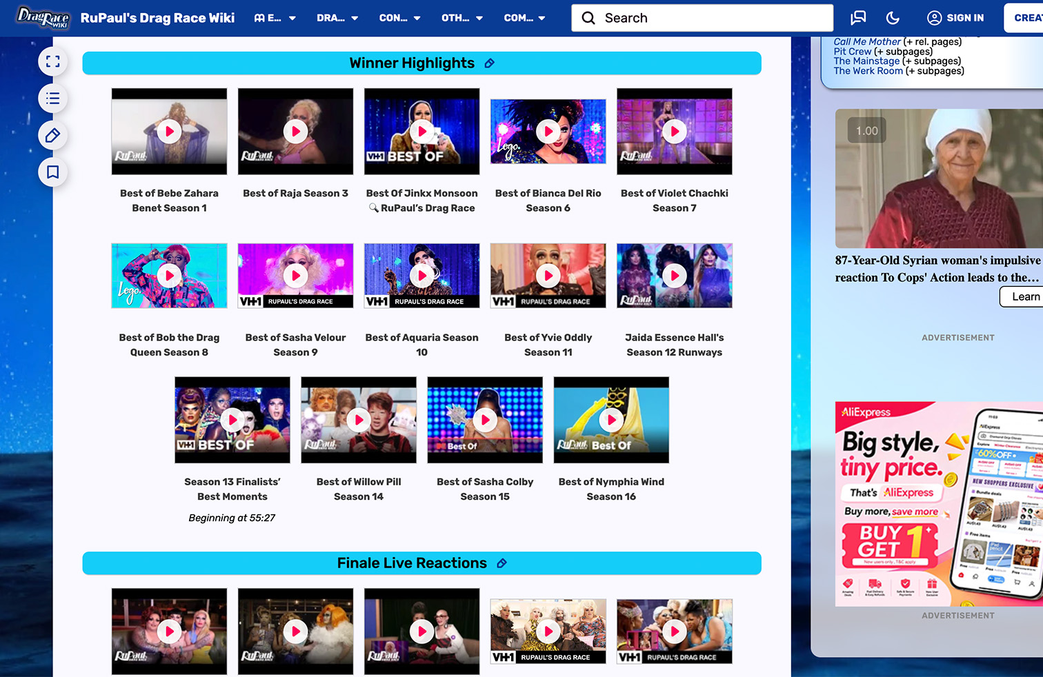
As an avid member of the RuPaul’s Drag Race fandom, revisiting the show’s history to find hidden patterns and try to predict future production decisions is more than a pastime, it's a sacred ritual! However, the only viable option for fans like myself to access accurate, digestible information is the devil reincarnate herself: the Wiki fandom. With multiple information-dense excel tables and a low-resolution sparkle background that only mildly references the RPDR's visual aesthetic, the site makes data interpretation difficult and lacks the sensory excitement that the show is renowned for, hindering immersion.
DESIGN PRINCIPLES
DESIGN PRINCIPLES
Every design decision was shaped by the following philosophy: the infographic needed to be informative, interactive and immersive.
01
INFORMATIVE
Offer accurate, up-to-date data to establish trust and prompt re-visits.
02
INTERACTIVE
Provide touchpoints that enhance user control and enable personalisation.

03
IMMERSIVE
Use RPDR’s visual identity to blend entertainment with data analysis, enhancing engagement.

APPROACH
APPROACH
The infographic was built in Figma, comprising of design assets created in Adobe Illustrator to blend data analysis with entertainment.
01
Ideation
DATA COLLECTION
To provide a holistic and meaningful snapshot of the RPDR winners’ track records at a glance, I decided to incorporate the following data points into the infographic:
1. Placement: How the queens performed in each challenge (i.e., win, top, safe, low, bottom)
2. Challenge Type: Which skills were tested during the main challenge that the queens participated in (i.e., performance, comedy, design, brand)
3. Age: How old the winning queen was when she was crowned ‘America’s Next Drag Superstar’
4. Season and Episode Number: When each queen appeared on RPDR and at what point during the season the challenge was
5. Episode Explanation: An explanation of the main challenge
6. Year: When in time each queen appeared on RPDR and how recently their season aired
INFOGRAPHIC LAYOUT
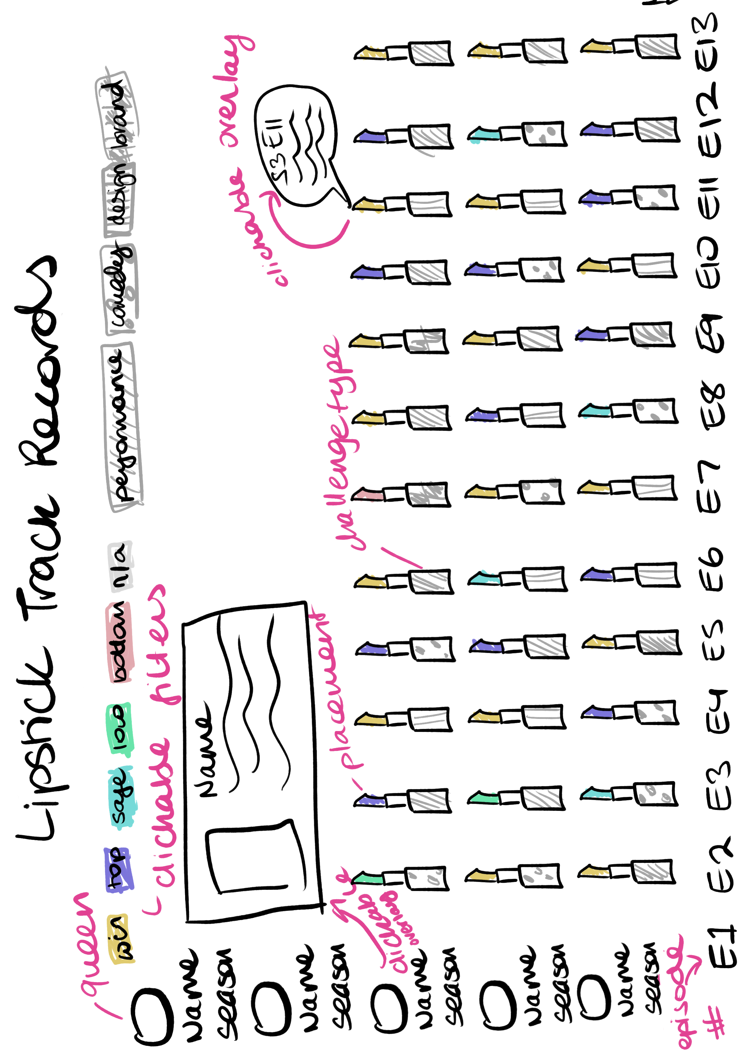
When brainstorming different ideas for how to present the data, I decided to create a vertical chart layout due to its simplicity, clear information hierarchy, and being able to complete it within the allotted timeframe. When consulting infographic sites like The Pudding and the Hungry Tech Giants for inspiration, I decided to add interactivity through building a clickable filter UI to allow users further segment the data, making the information feel more digestible, intuitive, and easy to navigate.
02
Development
VISUAL IDENTITY
By brainstorming the visual metaphors that are typically associated with RPDR, I considered various creative ways of visualising the data: think heels, wigs, glitter! Out of all the brainstorm results, I was immediately drawn to the idea of using lipsticks as the core data point (i.e., for each queens’ placement and the challenge type).
WHY A LIPSTICK?
Not only are lipsticks a staple makeup product for any drag queen worth their salt, but - most importantly - they’re instantly recognisable to RPDR fans as the way queens voted out bottom contestants on RPDR All Stars, resulting in some of the most iconic moments for the franchise.  *THE SHADE!*
Don't believe me? See for yourself!
To ensure the infographic reflected the show’s visual aesthetic, I created a RPDR moodboard and made the following design choices aligned to its visual language:
COLOUR PALETTE
Hero Colour:
'Placement' Data Point:
The Hero Colour aligns with the show’s hot pink aesthetic, while the ‘Placement’ pastel tones complement the hero colour while contrasting its intensity.
TEXTURES
Background:
'Challenge Type' Data Point:
The glitter, bokeh and gradient textures evoke the feeling of glamour and celebration, emotions commonly associated with RPDR. The ‘Challenge’ textures are inspired by typical lipstick finishes i.e., glitter, gloss, cream, metallic, matte.
TYPOGRAPHY
Heading:
Body:
‘Cheesecake’ elicits the feeling of bubbliness and elegance due to its curvature, while ‘Omnes’ is a legible sans serif whose width and medium-weight complements the Heading.
LIPSTICK MOTIF
The lipsticks, their textures and the infographic background were all designed in Adobe Illustrator and then transferred to Figma. Once I began populating the Figma file, I decided to further differentiate the lipstick’s designs and include additional data by:
1. Creating a checkered lid for the RPDR's 'signature' challenges (i.e., the ones that popularised and became mainstays of the show). The pattern choice was inspired by the drag race flag held by RuPaul in the show’s title sequence.
2. Designing a distinct gold lipstick for the episode that declared each winning queen America’s Next Drag Superstar (i.e., the winner of RuPaul’s Drag Race), ensuring it stood out from the rest.
WIN
TOP
SAFE
LOW
BOTTOM
N/A
FINALE LIPSTICK & SIGNATURE LID
03
Prototyping
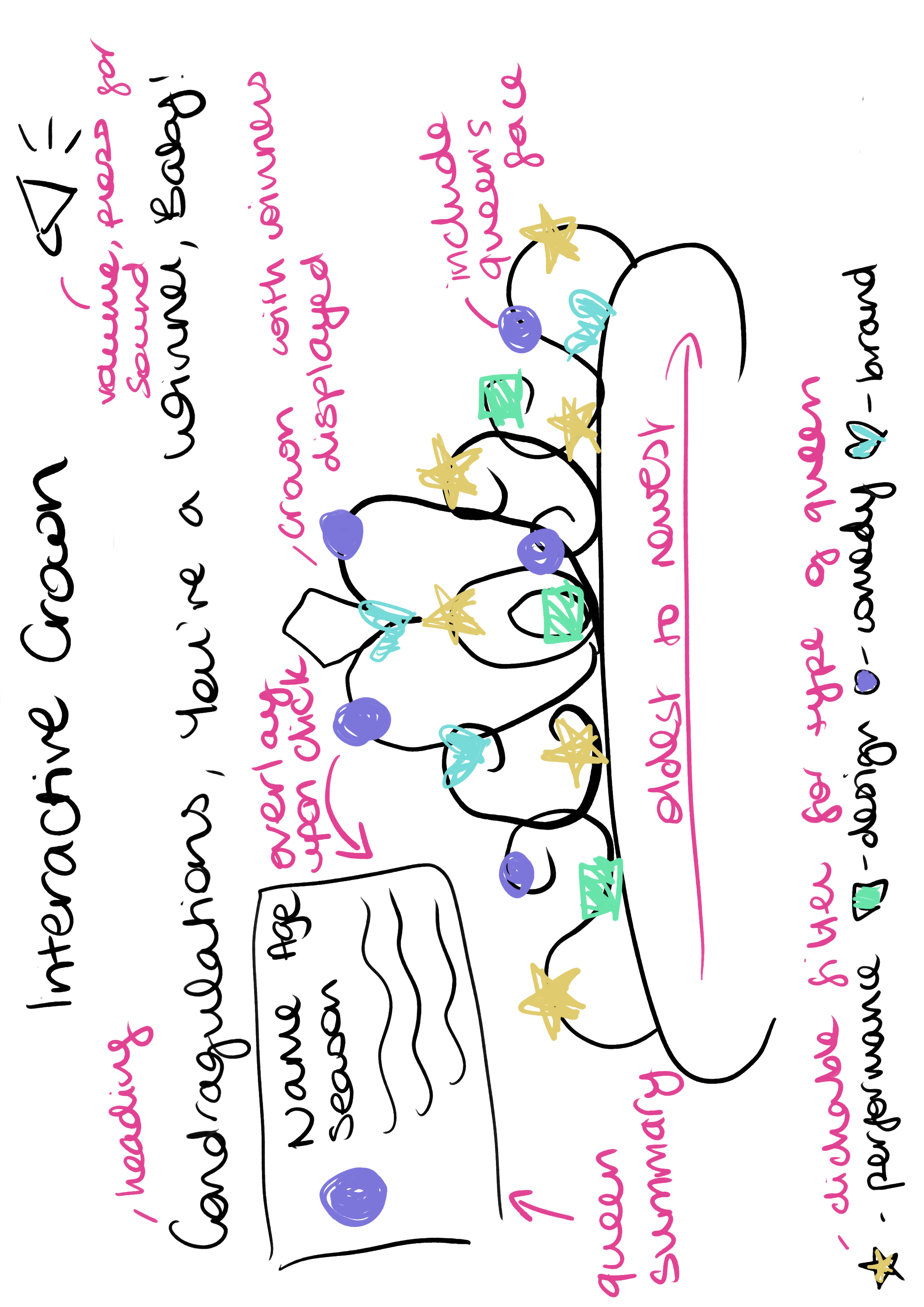
I organised the Adobe Illustrator design assets into a Figma file and added 5 key interactive elements to enhance user control, personalisation and engagement:
01 CLICKABLE FILTER UI
Built a clickable filter UI to allow users to further segment the data, making the information feel more digestible, intuitive, and easy to navigate.
O2 EPISODE DESCRIPTION OVERLAY
Added clickable speech-bubble overlays to each lipstick to provide users with contextual information about each episode, deepening their understanding of the show’s lore.
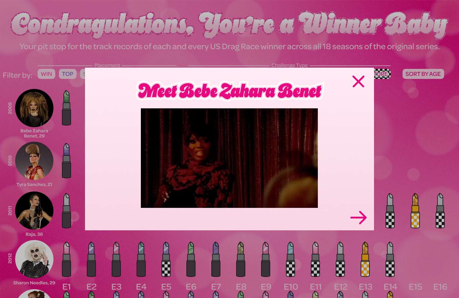
03 ABOUT THE QUEEN OVERLAY
Added a clickable overlay to each queen’s photo that provides information about their legacy, with embedded entrance videos to further educate users and diversify engagement beyond text.
04 MUSIC PLAYS UPON ENTRY
Integrated the chorus of RuPaul’s ‘Condragulations’ onto the landing page for greater immersion and sensory engagement from the outset.
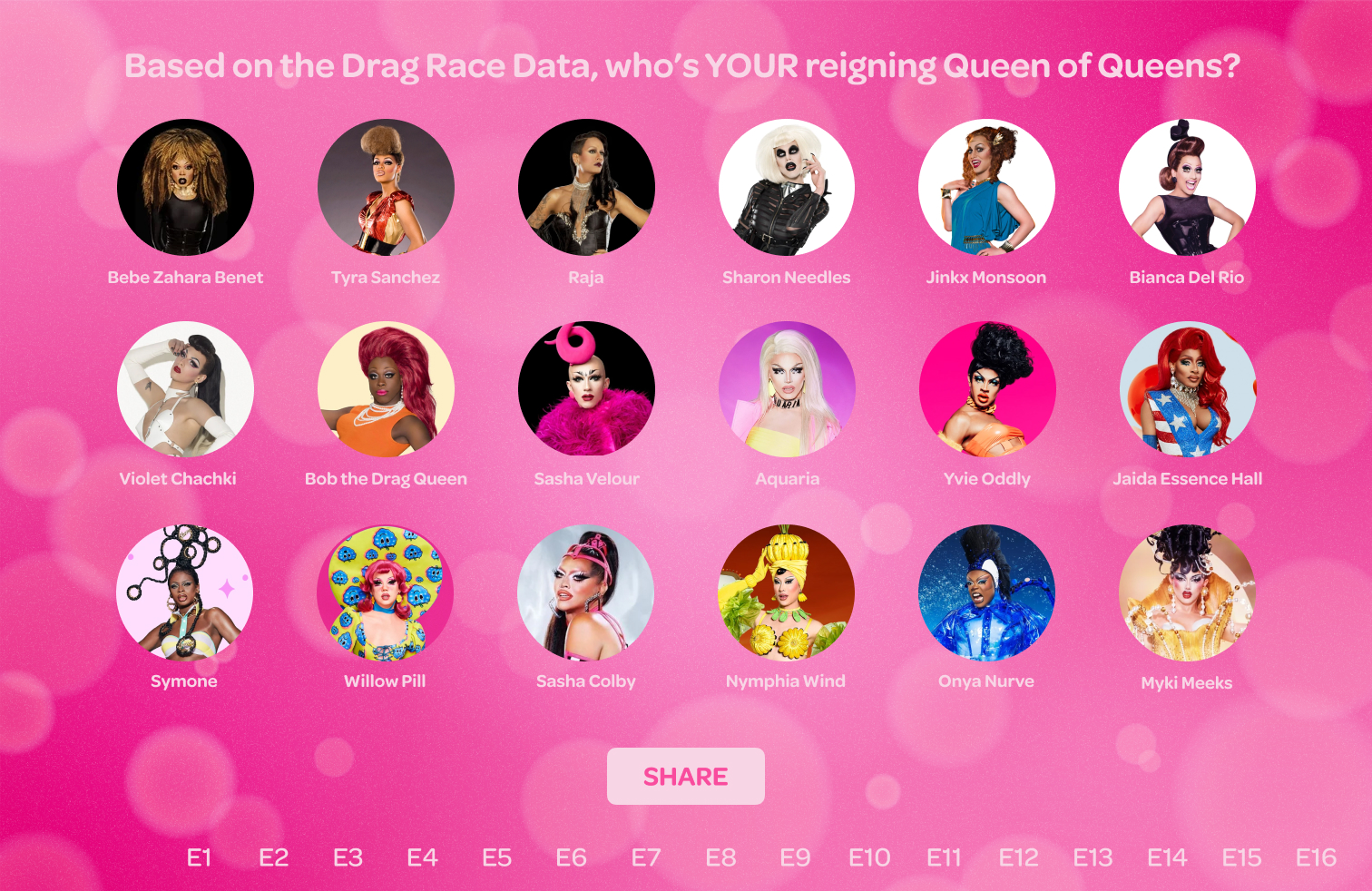
05 FAVOURITE QUEEN CTA
Added a call-to-action where users can select their favourite queens and - if the site were  public - share the infographic to prompt further community engagement.
OUTCOME
OUTCOME
The infographic leverages interactions to educate users on the winners’ legacies, encourage personal interpretation of the data and immerse the user in the vibrant world of RPDR.
Interactive RPDR Winners Infographic
Current RPDR Winners Wiki Page
REFLECTION
REFLECTION
The infographic fulfilled its core purpose while highlighting opportunities to include more complex ways of segmenting the data.
Throughout the design process, there were ideas I had that were unable to be implemented due to either time constraints or limitations in Figma’s capability. Therefore, if the infographic were to be publicly published, I would make the following changes to allow for greater interactivity and more sophisticated data interpretation:
1. Allow users to select multiple filters simultaneously e.g., be able view performance challenges that the queens won
2. Add comparison viewer functionality for users to compare selected queens’ track records
3. Further differentiate the signature RPDR challenges (i.e., checkered lids) by adding graphics that represent different signature challenges to the lids e.g., fire for the RuPaul Roast, sewing needle for the Design Balls
4. Embed additional video clips to the ‘About the Queen’ overlay to further showcase the queens’ best moments and personality
LET'S CHAT
Like what you see? Then I'd love to hear from you!
GET IN TOUCH
AS