PROBLEM
PROBLEM
Glassons app users encounter friction at 3 key stages of the shopping journey: the homepage, the search function, and size guidance. These issues reduce session depth, and cause early app abandonment, diminishing the brand’s user retention and in-app sales.
As a former Glassons devotee who used to spend her entire hospitality earnings on their clothing, I’ve always found their app to be unintuitive and antithetical to their trendy, minimalist and functional aesthetic. This project aimed to discover why the brand’s user experience feels this way and improve upon those design decisions to create a seamless and exciting shopping experience that reflects the brand’s core identity.
To identify the root cause of the Glassons app’s deficiencies, I conducted 3 key activities:
01
UX SURVEY
12-question research survey completed by 15 respondents.
02
APP AUDIT
Completed a checklist produced by Eleken - a UX/UI design agency - that leveraged Jacob Nielsen’s 10 Usability Heuristics.
03
SWOT ANALYSIS
Conduct a SWOT analysis of 3 comparable womenswear websites: Princess Polly, Cotton On and H&M.
From these activities, 3 key themes emerged that defined the overarching problem statement:
01
The Home Screen Creates Confusion and Disorientation
~
25
%
Of open text responses criticised the homepage experience, describing it as “confusing” and “restrictive”
😕
Survey Respondent
“The homepage doesn't feel like a homepage, I was surprised that it ended so soon. I didn't really know where to go after.”

Acting as the user’s first impression of the app, disinterest in the home screen can lead to reduced session depth, increased bounce rates and even app deletion.
02
The Search Bar Hinders the Customer Journey
~
27
%
Of respondents selected the search bar and search results as the most confusing / frustrating feature of the app
😕
Survey Respondent
“[The most frustrating moment I experienced was] searching for an item in the exact words it is labelled as for it not to come up as a suggestion.”
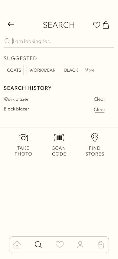
The search bar is critical in surfacing results tailored to users’ tastes and preferences, a poorly designed one can lead them to abandon the app prematurely.
03
Sizing Uncertainty is Preventing Purchase Conversions
~
33
%
Of respondents don’t complete a purchase because of confusion regarding sizing
~
53
%
Of respondents are more likely to complete a purchase if the size guide / fit assistant was improved
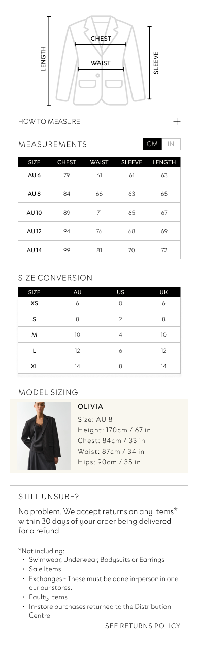
A key challenge for online stores is instilling fit confidence; without accessible and reliable sizing information, users default to physical stores and may bypass the app entirely.
APPROACH
APPROACH
Based on insights discovered through the UX research phase, I designed an updated version of the Glassons app in Figma, with a focus on improving its home screen, search functionality and size guidance.
01
UX Asset Development
To guide my decision-making, I created a user empathy map based on survey insights which informed the development of 3 user personas and corresponding user journey maps that targeted the overarching problem statement.

USER 1
MIA CHEN: 'THE CASUAL DISCOVERER'

24
Marketing Coordinator
Sydney, Australia
SPONTANEOUS
PLAYFUL
CHARISMATIC
EXPRESSIVE
Mia is a trend-aware fashionista who spends her downtime shopping for inspiration and saving items to her wishlist to inform her aesthetic. Constantly consuming content on social media, Mia expects fashion apps to encourage exploration the same way apps like Instagram or TikTok do.
“I’m not looking for anything specific, I want the app to show me something I love.”
NEEDS
- An inspiring, scrollable homepage with new / relevant content
- Ability to create multiple wishlists as moodboards
- Ability to browse freely without an account
MOTIVATIONS
- Experience the thrill of discovering something new on a casual browse
- Discover new trends and items that match her personal aesthetic
PAIN POINTS
- A sparse homepage that feels flat and unhelpful
- Being unable to create multiple wishlists
- Constant notifications and reminders to create an account
CHALLENGES
- Converting passive browsing into an actual purchase
- Convincing her to sign up and become a member
INFORMATION SOURCES

Instagram

TikTok

Influencer suggestions

Peer reviews

USER 2
SOPHIE WILLIAMS: 'THE INTENTIONAL SHOPPER'
28
Primary School Teacher
Melbourne, Australia
CONSIDERATE
METHODICAL
REFLECTIVE
PRAGMATIC
Sophie is a practical dresser who uses the little time she has to shop with purpose, often a specific item in mind. Her low tolerance for friction and ambiguity make the search bar and filters her greatest allies, and if an app won’t co-operate, she wastes no time transitioning to desktop to get the job done.
“I know exactly what I want, I just need the app to get out of my way.”
NEEDS
- A reliable, fast search function with smart suggestions
- Easy access to previously searched or recently viewed items
- Clear and useful filters
MOTIVATIONS
- Finding the exact item she’s looking for using the app’s tools
- Keep track of browsing history for future use
- Spending as little time on the app as possible
PAIN POINTS
- Search function fails to surface items that she knows exist
- Inaccessible browsing history
- Complicated filters that expand or extend her search
CHALLENGES
- Bridging the gap between knowing what she wants and using the app to help her find it
- Convincing her to browse aimlessly
INFORMATION SOURCES

Glassons website

Product reviews

Internet browsing
Peer reviews

USER 3
HANNAH TAIT: 'THE INFORMED BUYER'
31
Project Manager
Brisbane, Australia
ANALYTICAL
RESERVED
CAUTIOUS
WISE
Hannah is a sophisticated and creative dresser who treats fashion with intention. Relying on reviews and size guides to confirm her instincts before she commits to a garment, Hannah has no problem making a purchase when she has the right information at her disposal.
“If the app just told me what I need to know, I’d never hesitate to buy.”
NEEDS
- Personalised, item-specific sizing and fit guidance
- Aggregated social proof i.e. review summaries
- Photos of items in a real-world context i.e., on other users
MOTIVATIONS
- Completing a purchase confidently without needing to second-guess her decision
- Discover others are saying about items she’s considering
PAIN POINTS
- Size guides without fit context
- No visible review summaries or star ratings
- No reference images for how clothes look in the real world
CHALLENGES
- Overcoming the inherent uncertainty of e-commerce in the retail industry
- Providing hyper-personalised information e.g., VR/AR try-ons
INFORMATION SOURCES
Instagram
Product reviews

In-store staff
Peer reviews
I brainstormed ideas for how to address each of the core user pain points, selecting options for implementation based on their impact on the user experience, time constraints and my Figma capability at the time.
02
Prototyping
I built the high-fidelity app mockup in Figma based on my initial low-fidelity wireframes, informed by the user flows I developed for each persona.
HOMESCREEN


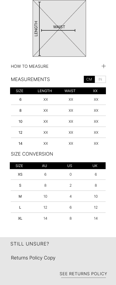
SIZE & FIT






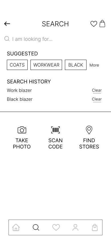
SEARCH BAR
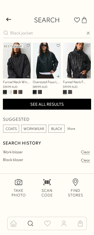
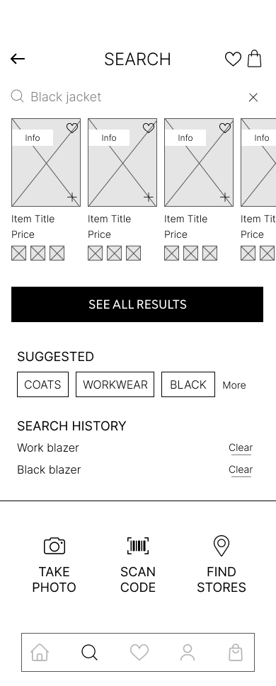
ADDITIONAL SCREEN UPDATES
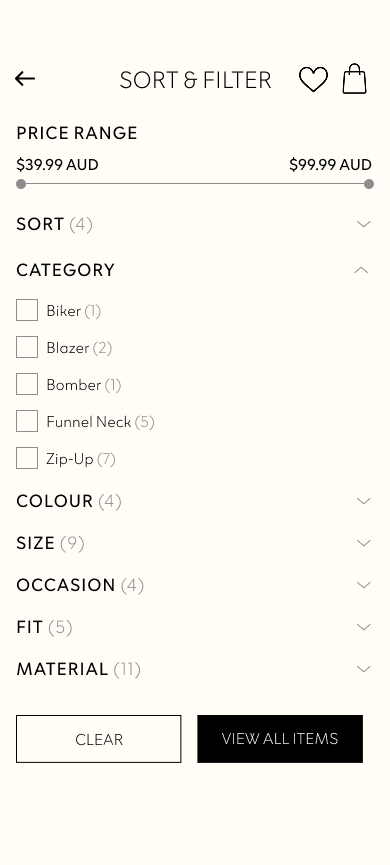
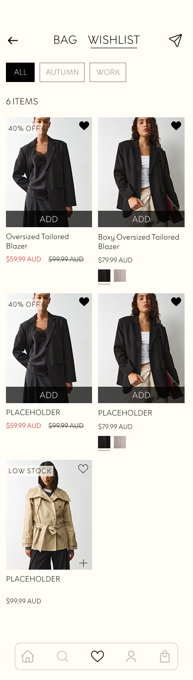
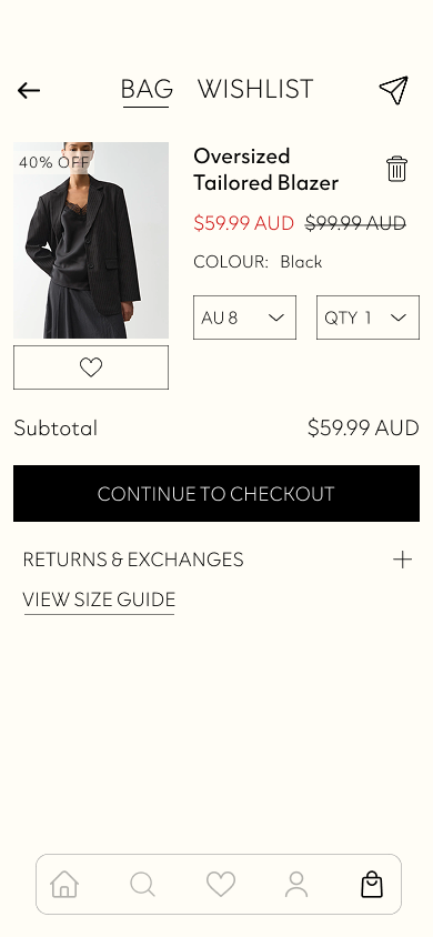
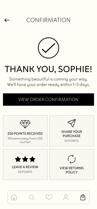
- Sort & Filter: Added a counter next to each filter heading to indicate the number of categories, added added a price slider for easier adjustment and greater user control, and included a 'Fit' category for greater data segmentation
- Wishlist: Added the ability to create moodboards to encourage creative inspiration and enable categorisation
- Bag: Added size guide and returns information for easy access for User Persona 3, made 'Add to Wishlist' and 'Remove Item' actions more visible for the user
- Confirmation: Added widgets to share purchase, leave a review or view the returns policy for quick access to post-purchase actions
03
User Testing
To evaluate the usability of my version of the Glassons app, I interviewed 5 participants, observing how they completed key tasks to identify friction points that hinder task completion and reveal opportunities for improving the app experience.
TASK
U1
U2
U3
U4
U5
P1.1 Find a way to start browsing without signing up.


P1.2 Browse the workwear edit and apply a filter to surface blazers.

P1.3 Add a blazer to your wishlist.
P1.4 Review your wishlist and add the blazer to your cart.

P2.1 Use the search bar to find a black jacket.
P2.2 Apply a filter to surface blazers.
P2.3 Add the blazer to your cart and checkout using your saved details.
P3.1 Check the size guide on the product details page and confirm your size.
P3.2 Find the review section and browse user reviews.
P3.3 Add the blazer to your wishlist and review all of your saved wishlists.
P3.4 Add the blazer to your cart and checkout using your saved details.

Task completed

Task partially completed / with difficulty

Task could not be completed

NA - not assessed
USER 1
MIA CHEN: 'THE CASUAL DISCOVERER'
NEEDS
- An inspiring, scrollable homepage with new / relevant content
- Ability to create multiple wishlists as moodboards
- Ability to browse freely without an account
PAIN POINTS
- A sparse homepage that feels flat and unhelpful
- Being unable to create multiple wishlists
- Constant notifications and reminders to create an account
TASK COMPLETION OVERVIEW
P1.1 Find a way to start browsing without signing up.
- All 3 users completed seamlessly
- U3 remarked that they would have abandoned the app if sign-up was required; U5 similarly remarked that they rarely sign up for websites
P1.2 Browse the workwear edit and apply a filter to surface blazers.
- Users took between 20-45 seconds to locate the edit tile
- A Figma bug caused the Category filter options to glitch, resulting in confusion from users
P1.3 Add a blazer to your wishlist.
- All 3 users experienced confusion due to the lack of confirmation / feedback when an item was added to the wishlist (this was due to the limit on the number of interactions allowed within the free version of Figma)
P1.4 Review your wishlist and add the blazer to your cart.
- 2 users were unable to complete this task due to an overlooked touchpoint in users navigating to the cart from the product details page (i.e. not only the wishlist page), the initial user flow did not include this step
- U5 remarked that the checkout process felt seamless, defined and clear
😕
User #3
“The homepage felt overwhelming with all the images and sections.”
User #1
“The homepage was a bit messy with the edits and individual clothing, you just need the bare basics.”
😕
😕
User #3
“I thought [the blazer] didn’t add to my wishlist because the heart was not coloured in.”
Navigation friction was most concentrated to the busyness of the homepage and the lack of confirmation when adding an item to the wishlist.
RECOMMENDATIONS

Simplify the homepage to avoid overwhelm, removing the edit tiles and streamlining the included categories
Add a clear confirmation state to the wishlist overlay to provide user feedback, ensuring the heart icon turns black and a confirmation toast appears
Add an interaction that navigates users to the cart from the product details page to avoid confusion and halting the user journey
USER 2
SOPHIE WILLIAMS: 'THE INTENTIONAL SHOPPER'
NEEDS
- A reliable, fast search function with smart suggestions
- Easy access to previously searched or recently viewed items
- Clear and useful filters
PAIN POINTS
- Search function fails to surface items that she knows exist
- Inaccessible browsing history
- Complicated filters that expand or extend her search
TASK COMPLETION OVERVIEW
P2.1 Use the search bar to find a black jacket.
- U1 completed seamlessly
- U2 and U4 experienced a slight pause on the initial search results page, implying confusion; U2 remarked that comparable apps typically surface all results immediately
P2.2 Apply a filter to surface blazers.
- U1 and U2 completed seamlessly
- U4 experienced a Figma bug that caused the Category filter options to glitch, yet still managed to navigate the menu correctly
P2.3 Add the blazer to your cart and checkout using your saved details.
- All 3 users checked out seamlessly
- U4 praised the single-screen checkout format, comparing it to other apps that require multiple screen navigation for different steps in the checkout process
😕
User #2
“When I get to search results my immediate thought is there’s only 3 black jackets [...] I would say that in other apps I see all results immediately.”
User #4
“It was a nice condensed version of a checkout [...] it was all in one seamless scroll.”
😄
😄
User #1
“That was very easy, nothing confusing about that.”
The strongest performing persona flow during testing; the primary friction point was navigating from the initial search results page to the ‘see all results’ page.
RECOMMENDATIONS
Remove the initial search results page to avoid confusion and align experience to comparable apps
USER 3
HANNAH TAIT: 'THE INFORMED BUYER'
NEEDS
- Personalised, item-specific sizing and fit guidance
- Aggregated social proof i.e. review summaries
- Photos of items in a real-world context i.e., on other users
PAIN POINTS
- Size guides without fit context
- No visible review summaries or star ratings
- No reference images for how clothes look in the real world
TASK COMPLETION OVERVIEW
P3.1 Check the size guide on the product details page and confirm your size.
- All 4 users completed seamlessly and remarked that they appreciated the inclusion of an ‘As Seen on You’ section so they can see how items fit in a real-life context
- The model’s measurements section was praised by U2, U3 and U5
P3.2 Find the review section and browse user reviews.
- All 4 users located the reviews easily
- U3 and U4 remarked that they appreciated the inclusion of user photos within reviews to support their decision-making
P3.3 Add the blazer to your wishlist and review all of your saved wishlists.
- 3 users experienced confusion due to the lack of confirmation / feedback when an item was added to the wishlist (this was due to the limit on the number of interactions allowed within the free version of Figma)
- U2 was unexpectedly navigated to their wishlist once they added an item to it, causing confusion and disrupting their journey
- U2 suggested an ‘Alert me’ feature for out-of-stock / sale items
P3.4 Add the blazer to your cart and checkout using your saved details.
- 2 users were unable to complete this task due to an overlooked touchpoint in users navigating to the cart from the product details page (i.e. not only the wishlist page), the initial user flow did not include this step
- U4 and U5 completed their checkouts seamlessly
- 3 users suggested a bag icon counter or confirmation state to provide feedback that an item has been added to the bag
😕
User #3
“I wasn’t sure if the [item saved] in one wishlist, multiple, or none at all.”
User #4
“It would be good for the bag icon to update with a number notification to verify something’s been added.”
😄
😄
User #5
“[The checkout process] felt very seamless with no blocks, as a shopping app that’s the most important part.”
The primary friction point was the lack of confirmation when adding an item to the wishlist, with an opportunity to provide feedback when adding an item to the cart.
RECOMMENDATIONS
Add a clear confirmation state to the wishlist overlay to provide user feedback, ensuring the heart icon turns black and a confirmation toast appears
Add a bag counter badge to provide user feedback, ensuring the count updates in real-time
SYSTEM USABILITY SCALE QUESTIONNAIRE INSIGHTS

Agreed or strongly agreed that they felt very confident using the app.
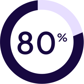
Agreed that the app’s different functions were well integrated, with the remaining 20% feeling neutral about the statement.
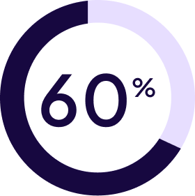
Strongly agreed that the app was easy to use, with the remaining 40% agreeing with the statement.
